
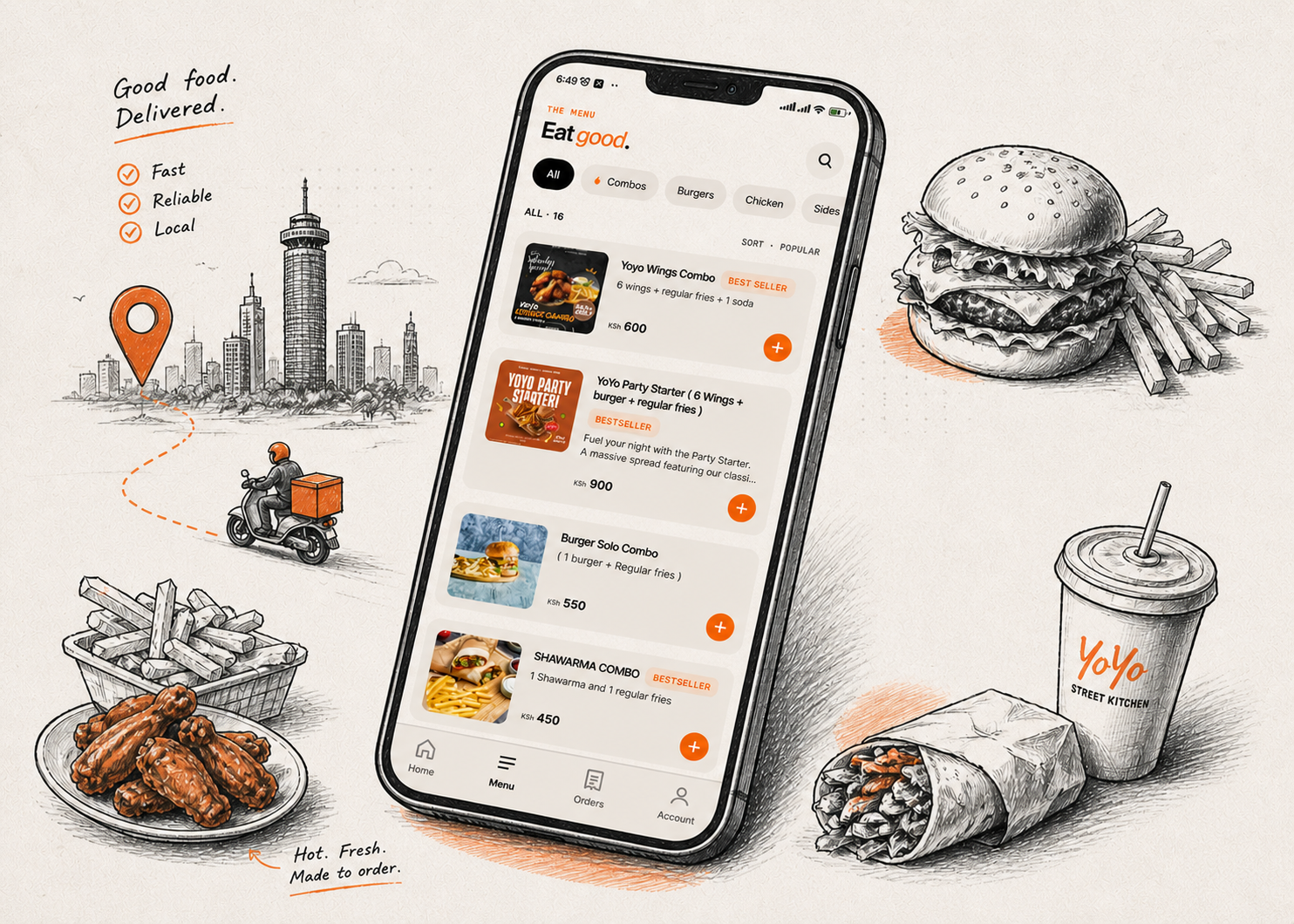
How a Nairobi Street Kitchen
got a Big-Tech
Ordering Experience
A local food spot. A global ordering experience. Built guest-first, priced in KSh, and designed around how people in Nairobi actually eat and pay.
michaelloupa@gmail.com
The gap between demand
and experience
In Nairobi, most street kitchens don't have apps. They have WhatsApp. Orders come in as texts. Clarifications go back and forth. Locations are shared as pins. Payments happen separately. There's no tracking, no saved preferences, no real system.
It works. But it's slow, fragmented, and full of friction. YoYo Street Kitchen started with a simple idea: what if a local food spot could offer the same ordering experience as a global chain, without the cost or complexity?
The demand already existed. The problem was the gap between “I want food” and “food is on the way.”
Back-and-forth messaging
Customers confirm orders across multiple WhatsApp messages. Every clarification adds minutes and creates room for error.
Manual location sharing
Delivery address is sent as a dropped pin, then re-described in text. No address memory, no autocomplete, no structure.
Disconnected payments
Payment happens outside the ordering flow — a separate M-Pesa till number, a screenshot, a manual confirmation. No real-time link.
The real problem
It's not discovery. People know YoYo exists. The friction is entirely between intent and completion — and that's a design problem.
Designing for hunger,
not accounts
Most apps treat signup as the starting point. But hunger doesn't wait. So YoYo was built guest-first — the product never gatekeeps hunger behind a login screen.
Sign-in exists, but it's optional. The experience is complete without it. This isn't a technical compromise — it's a product decision rooted in real user behaviour.
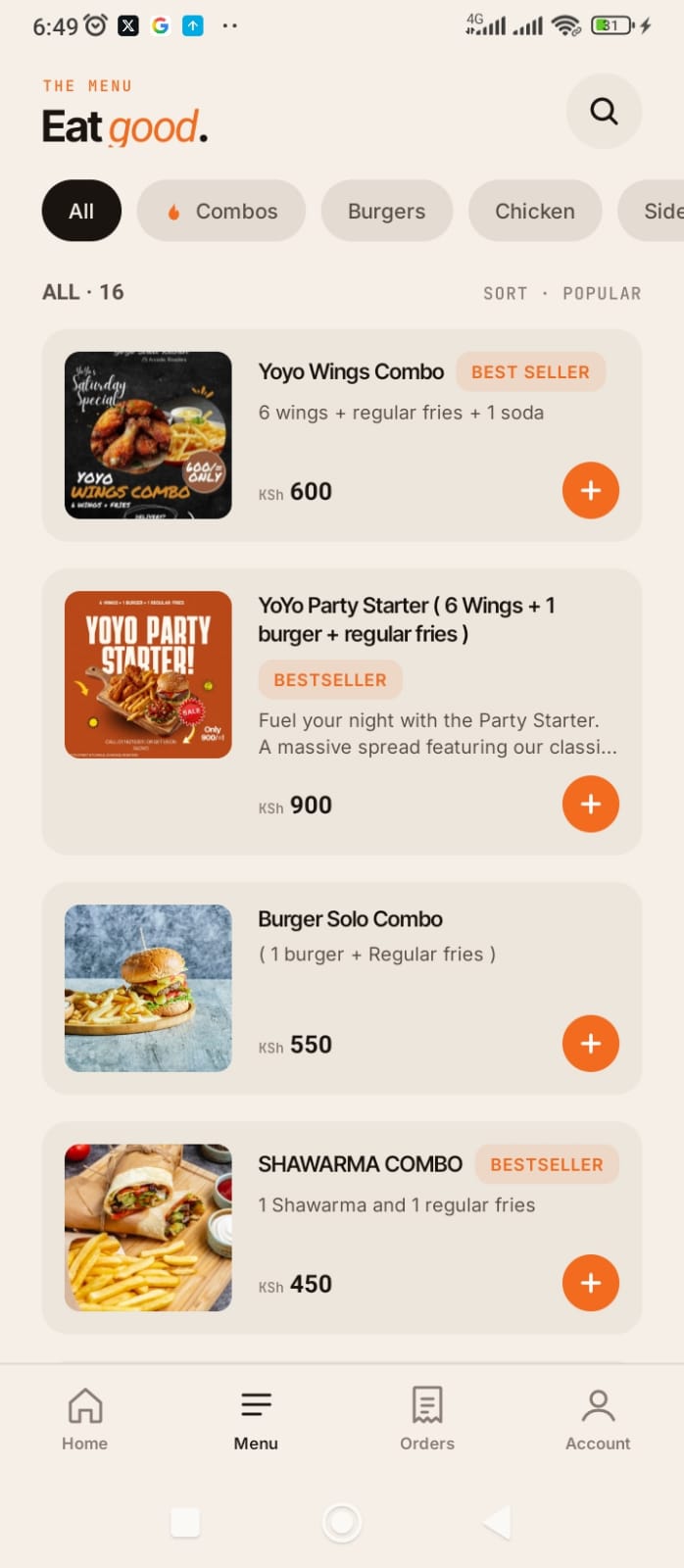
Browse instantly, no barrier
Menu is visible immediately on open. No onboarding screen. No permission prompts before the user can see food.
Add to cart immediately
One tap adds an item. Quantity, customisation, and add-ons follow — but the action starts with a single gesture.
Checkout without an account
Guest checkout is the default path. Account creation is offered post-order, never before. The order is never held hostage.
One job per screen
Every screen in the flow has a single clear action. Reduce time between intent and completion — that's the only metric that matters.
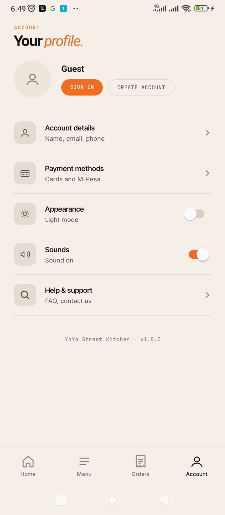
Account screen — sign-in optional, order first
A tight end-to-end flow,
from browse to doorstep
The app is built as a tight, end-to-end ordering flow. No dead ends. No confusion about what to do next. Each step removes one piece of friction that used to live in a WhatsApp thread.
Delivery or pickup options both resolve to the same clean confirmation state. The customer always knows exactly where their order is.
The average decision time for a food order under hunger is under 90 seconds. The menu is optimised for that window, not a leisurely browse.
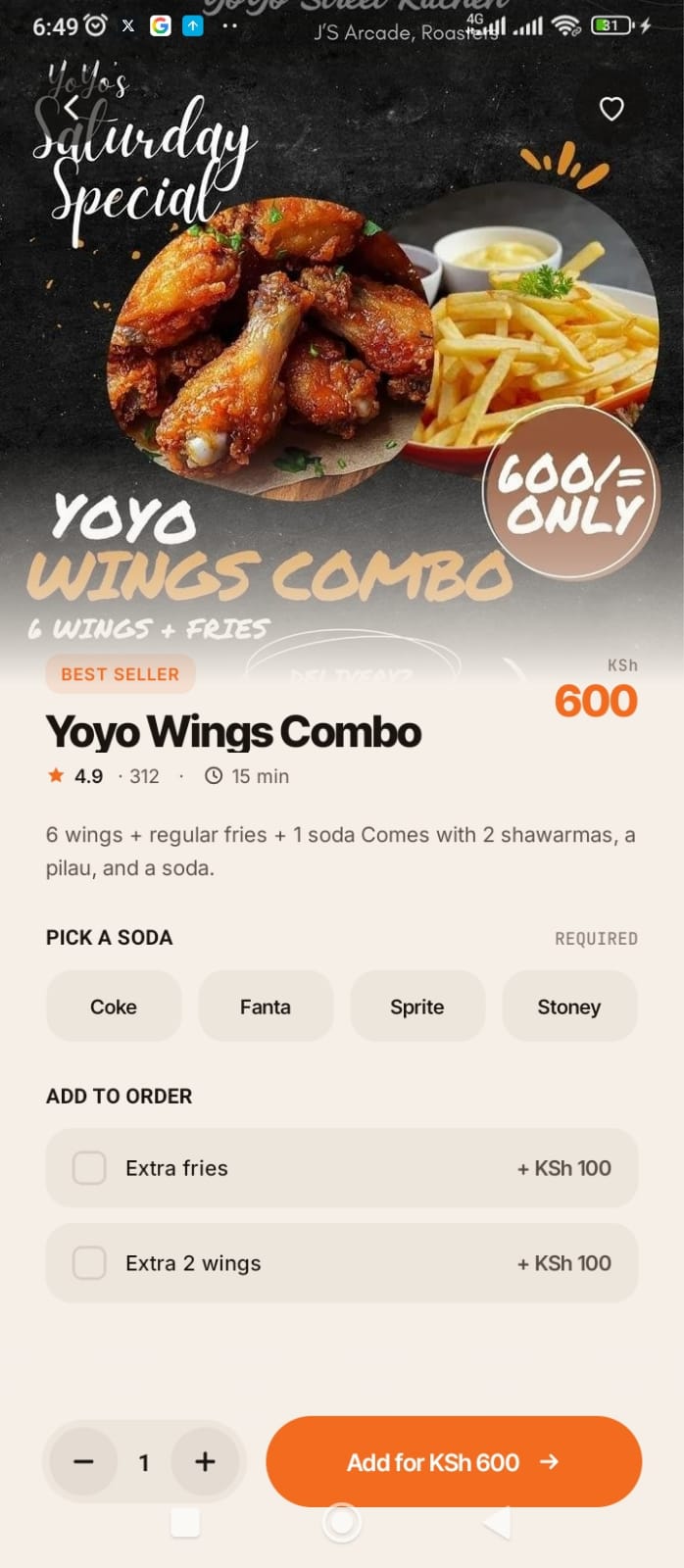
Menu browse · Item detail & customisation
Not customised for Africa.
Aligned with it.
Most food apps in Africa feel imported. The currency is wrong, the payment options are wrong, the address input doesn't match how people actually describe locations. YoYo is not a foreign product adapted for Nairobi. It's built from Nairobi outward.
Prices in KSh, not USD
No conversion, no approximation. Every price is exactly what the customer pays at the till — KSh 600, KSh 900, KSh 450.
M-Pesa as primary payment
Not a secondary option buried in settings. M-Pesa is the primary checkout path — because that's how Nairobi pays.
Nairobi address input
Address fields and autofill are structured around real Nairobi delivery areas — estates, landmarks, and zones that make sense locally.
Designed for real-world conditions
Fast loads, minimal data usage, offline-tolerant states. The app assumes inconsistent connectivity, not ideal conditions.
Good products are
feedback systems
Great design at the flow level isn't enough. The details — what happens when you tap, what you see after you order, how progress is communicated — are where trust is built or lost. YoYo introduces subtle but meaningful feedback at every key moment.
These aren't decorative. They reduce uncertainty. They build the kind of quiet confidence that makes a user trust the app enough to order again.
Everything is intentional.
Nothing is decorative.
The visual system in YoYo is built for one outcome: making the ordering experience feel fast, clear, and reliable. Every decision connects back to that.
Single accent colour
Orange drives all interactive elements — add buttons, CTAs, labels. One colour means one meaning: “this is the action.”
Dark mode first-class
Not an afterthought. Dark mode is designed in parallel, with the same attention to contrast, legibility, and visual hierarchy.
Clean typography hierarchy
Three text levels — item name, descriptor, price — each sized and weighted to communicate importance without requiring the user to read.
Consistent spacing system
Uniform spacing between every element makes the app feel structured and fast to scan — even when the menu has 16 items.
Category filter chips
All · Combos · Burgers · Chicken · Sides. Horizontal scroll, pill shape, active state in orange. Discovery without overwhelm.
BESTSELLER social proof
The orange BESTSELLER badge is a design choice, not a marketing label. It shortens decision time and reduces buyer hesitation.
The result is a product that feels fast, clear, and reliable — the same three words a customer uses to describe a place they want to order from again.
Experience it firsthand
The best way to understand the product is to use it. The YoYo Street Kitchen app is available as an Android APK — no App Store required.
Most people think the gap in African tech is infrastructure. But often, the real gap is experience. YoYo is a simple example of what happens when you take something familiar — food ordering — and rebuild it around speed, context, and real user behaviour.
Not every business needs a super app. But many need something better than WhatsApp.